Photography, Composition & Photoshop
When creating a poster there are various different areas that you should consider, depending on your intended audience.
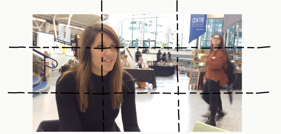
Firstly, you'll probably want to include some kind of imagery into your design. It's best to take your own photos so you know you own the copyright. Therefore, you need to understand a bit about composition of an image - see the video below.
Information on copyright free material.
9 Photo Composition tips
Colour Palette
Having a complimentary colour palette is important within design. This website lets you upload your images to see the colours that are included and suggests colours you could use in your design for text or other elements:
Quickly generates colour schemes that you can include within your designs.
Both include the Hex Colour Code, which you can use in software such as Photoshop to get the exact colour required.
Learning Typography
The text you use on your posters will also have an impact on your overall design and your audience. Tips and tutorials on choosing different typography.
Find out complimentary font combinations.
Photoshop
Photoshop is a great tool to create anything you can imagine. Adobe has lots of different tutorials you can follow to improve on your skills or give you answers to your questions.
Learn the basics or refine your skills with tutorials designed to inspire.